Brand Education App for a Healthcare Holding.

/
Context
A new brand identity needed to reach 16,000 employees.
SRH operates 46 companies in healthcare, education, and social services. With the new corporate identity, the brand needed to reach 16,000 people across all locations. Static portals and PDF guidelines could not turn employees into actual ambassadors of the new brand.

/
My Role
Owned the project from concept to rollout.
I led the project end to end: concept, information architecture, UX and UI design, prototyping, developer coordination, QA, and rollout. I worked closely with the brand team in our agency, who had developed the new identity, and translated it into a digital format that holds up next to their print work.
/
Approach & Decisions
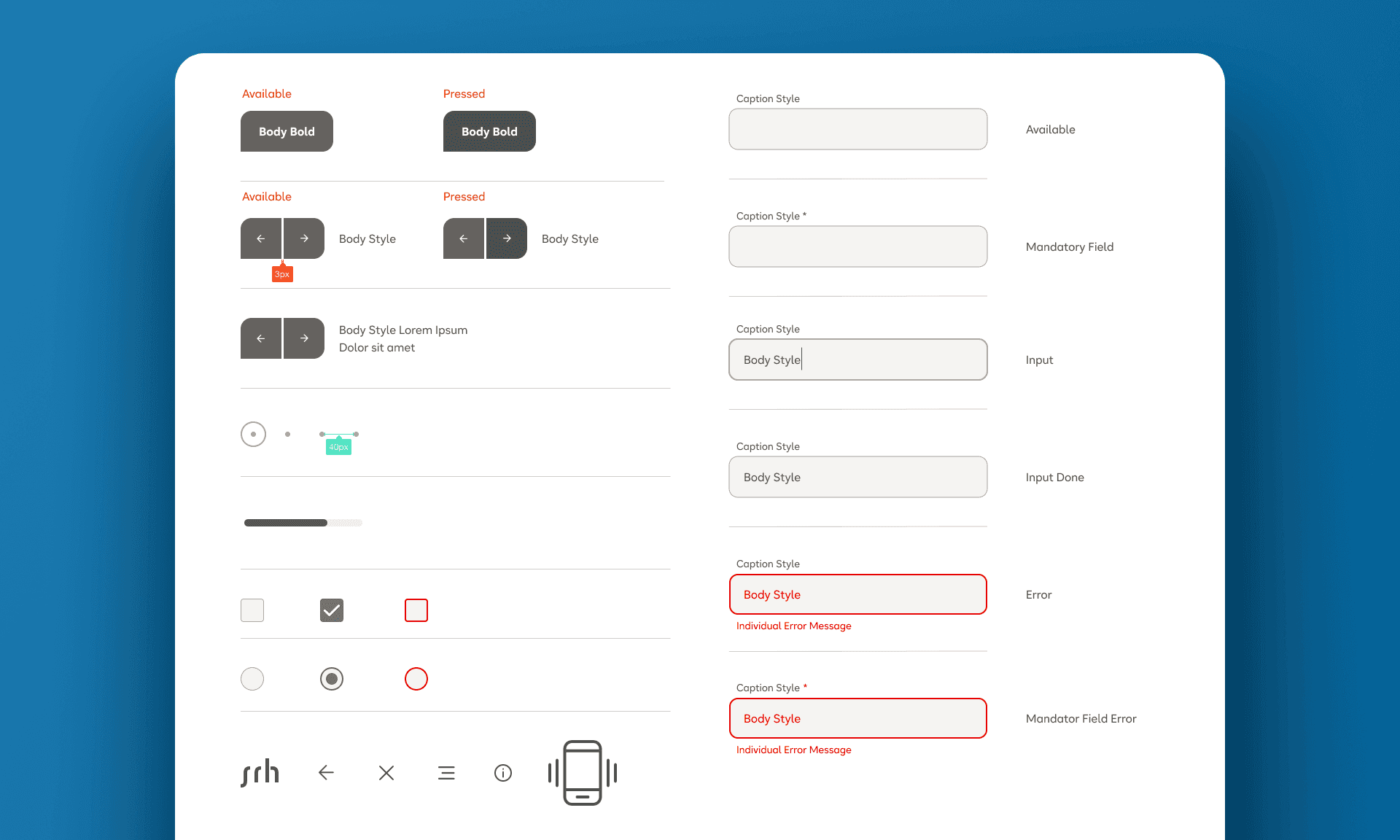
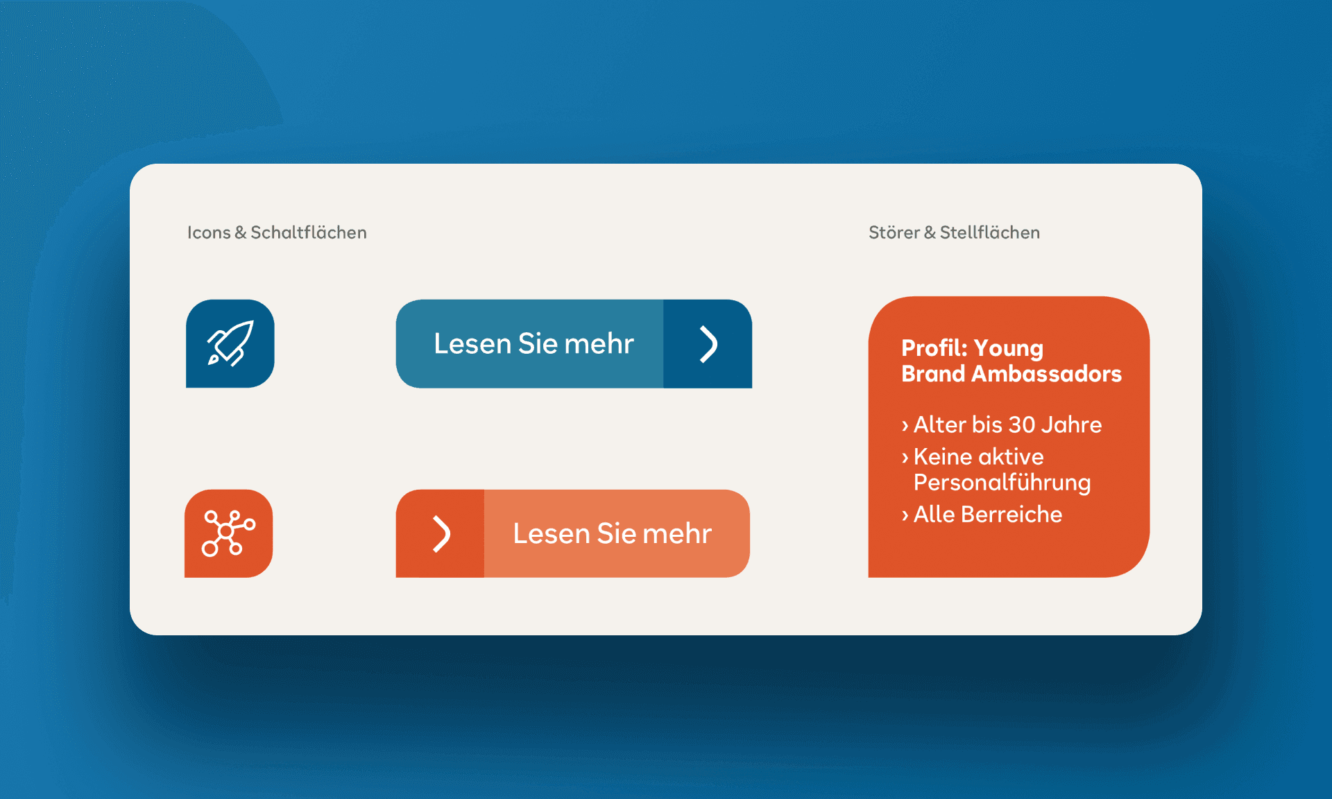
Editorial format with brand-coded color and custom type.
I designed the app as an editorial scroll experience, not a tool. The goal was to make employees feel the brand, not look something up. The color system codes the two brand poles: blue carries healthcare, orange carries education. Custom typefaces and icons hold the identity together where stock sets would feel generic.

/
Outcome
Launched as part of the official brand event in October 2020.
The app launched at the official brand event in October 2020 and is in use by SRH employees across the 46 group companies. It serves as the central digital touchpoint for the brand: news, identity, design principles, and key brand moments. The launch was the first visible product of the brand transformation.
/
More Work
Continue Exploring.
Other projects from my portfolio, spanning different industries and challenges.

