AI-Assisted Redesign of a Healthcare Portal.
NDA Notice. The visuals on this page are reconstructed concept work. They contain no original data and no original client screenshots.
/
Context
Filter, edit workflow, mixed user list: issues on every layer.
50 administrators manage 4,000 GPS-dispatched responders. Strategic goal: scaling to clinics, companies, and universities. The portal had grown function by function, with confusing filters, an unclear edit workflow, and a mixed user list. A 17-page audit across all five UX evaluation layers triggered the decision to rebuild instead of patch.

/
Approach
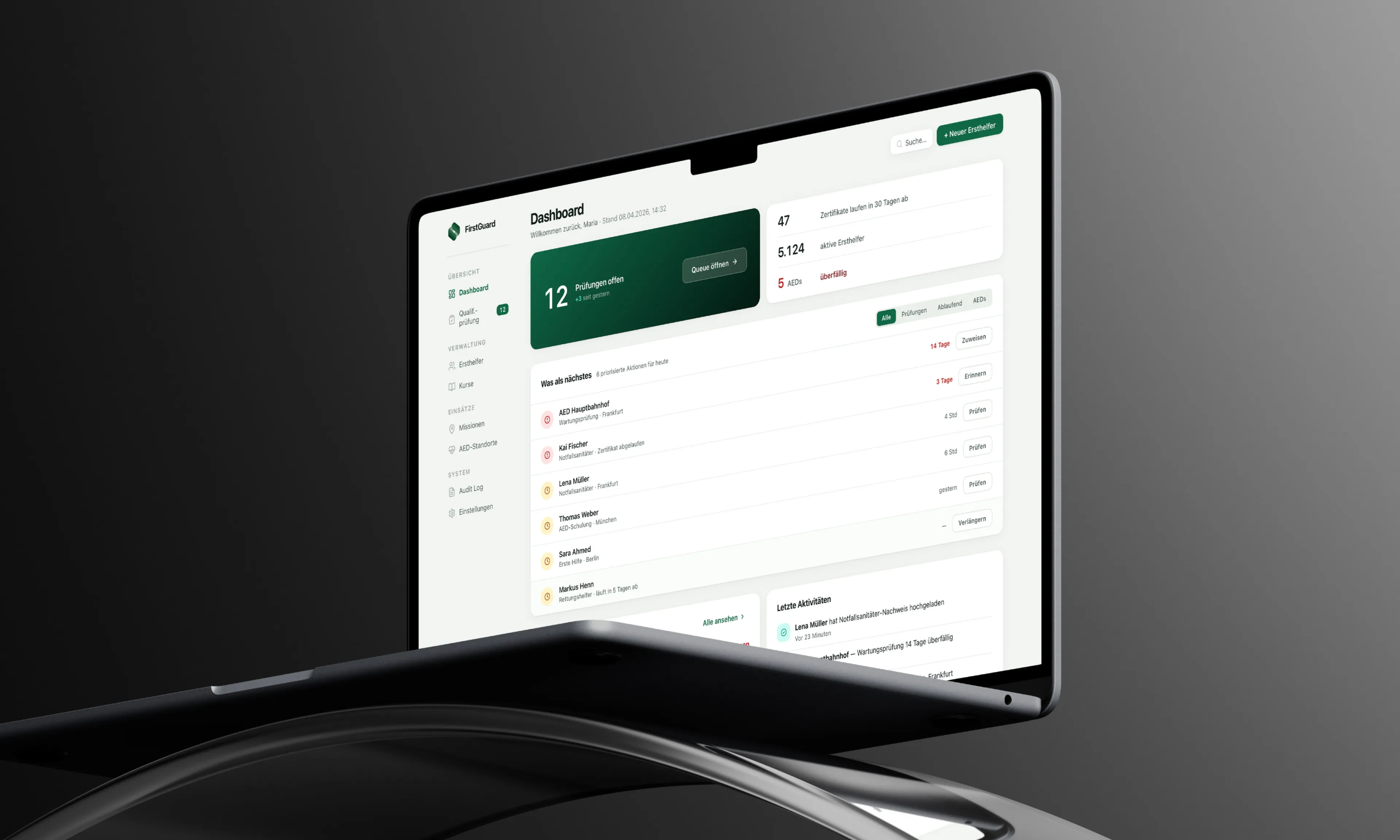
Two separate views, one mental model across the portal.
The hero KPI shows what needs action right now: 12 pending checks, not a wall of metrics. The audit revealed admins need a workflow, not just a list. A dashboard for triage, a separate responder view for detail work. Status colors apply across both: green for valid, yellow for soon, red for overdue.

/
Foundation
A token system designed to scale with the product's vision.
Two typefaces with separate roles: DM Sans for UI, Inter for numbers. Inter renders figures cleanly in columns, important when admins scan thousands of records and expiry dates. Every color tested for accessibility contrast. 196 design tokens form the handover foundation, structured to scale beyond government use.

/
More Work
Continue Exploring.
Other projects from my portfolio, spanning different industries and challenges.

